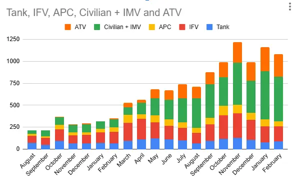
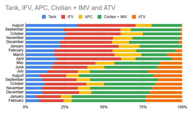
Wilshire@sopuli.xyz to Ukraine@sopuli.xyz · 1 day agoRatio of Russian military vehicle losses Aug 2023 - Feb 2025.sopuli.xyzimagemessage-square5fedilinkarrow-up175arrow-down11file-text
arrow-up174arrow-down1imageRatio of Russian military vehicle losses Aug 2023 - Feb 2025.sopuli.xyzWilshire@sopuli.xyz to Ukraine@sopuli.xyz · 1 day agomessage-square5fedilinkfile-text
minus-squaresaltesc@lemmy.worldlinkfedilinkarrow-up12·1 day agoFirst graph is percentages as a ratio. Second is figures. Losing tanks at the same rate as usual.


First graph is percentages as a ratio. Second is figures. Losing tanks at the same rate as usual.